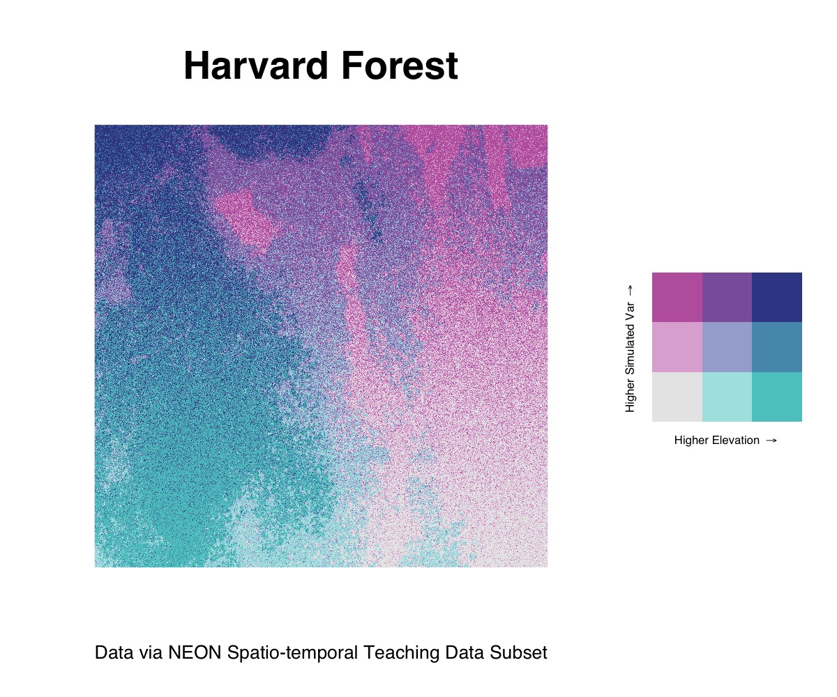
Though biscale focuses on bivariate mapping with vector
data, it is possible to adapt its workflow to create bivariate maps with
rasters. The following example is a reproducible example that relies on
some additional data and dependencies that go beyond what comes
installed with biscale itself.
Dependencies
To follow along with this example, you will need the
raster package for working with raster data and the
faux package for simulating a second variable:
install.packages(c("faux","raster"))In addition, you’ll need the cowplot package, which is a
suggested dependency for biscale. You can either install it
individually (faster) or install all of the suggested dependencies at
once (slower, will also give you a number of other packages you may or
may not want):
## install just cowplot
install.packages("cowplot")

## install all suggested dependencies
install.packages("biscale", dependencies = TRUE)
Once you have the dependencies installed, load the following packages:
Sample Data
The data for this example are stored in biscale’s GitHub
repository. They are a selection from NEON’s Spatio-temporal
Teaching Data Subset, which are available on figshare. These data
were created by Leah Wasser and Megan A. Jones, and are available under
a CC-BY 4.0 license.
The data consist of a .tif file describing elevation in
the Harvard Forest in Massachusetts. They need to be downloaded from
GitHub into your R session since they do not come within
the package itself due to the size of the file:
DSM_HARV <- raster("https://github.com/chris-prener/biscale/raw/main/data-raw/NEON_HARV_dsmCrop.tif")Data Preparation
Once you have the raster data downloaded, you will need to convert
them from a RasterLayer class object to a
data.frame:
neon_harv <- as.data.frame(DSM_HARV, xy = TRUE)Next, we’ll create a vector correlated with the y column
to simulate a bivariate relationship that we can map. To do this, we’ll
use the fuax::rnorm_pre() function to create a variable
that has a moderately strong correlation with y along with
a mean of 10 and a standard deviation of 2:
## create simulated data
neon_harv$sim <- rnorm_pre(neon_harv$y, mu = 10, sd = 2, r = 0.7, empirical = TRUE)

## rename NEON_HARV_dsmCrop
neon_harv$ele <- neon_harv$NEON_HARV_dsmCrop

## reorder variables
neon_harv <- subset(neon_harv, select = c(ele, sim, x, y))
Finally, we’ll create our bi_class column using the same
process we use with vector data. For this example, we’ll compare our
simulated data with the elevation data in the raster:
neon_harv <- bi_class(neon_harv, x = ele, y = sim, style = "quantile")Bivariate Raster Mapping
Mapping these raster data follows the same general workflow as our
vector data examples, but requires a few minor modifications. Instead of
using ggplot2::geom_sf(), we’ll use
ggplot2::geom_raster(). The arguments passed to
geom_raster() remain generally the same, however we need to
explicitly name the x and y columns:
map <- ggplot() +
  geom_raster(data = neon_harv , aes(x = x, y = y, fill = bi_class)) +
  bi_scale_fill(pal = "DkBlue") +
  coord_quickmap() +
  labs(
    title = "Harvard Forest",
    x = "",
    y = "",
    caption = "Data via NEON Spatio-temporal Teaching Data Subset"
  ) +
  bi_theme(base_size = 16) +
  theme(legend.position="none")
There are a few other key differences with the raster workflow to
note: * To project the data, we’ll use
ggplot2::coord_quickmap() * To suppress the default legend,
we need to use theme(legend.position="none") * Likewise, we
need to explicitly hide the x and y axis
labels using the labs() function
All of the legend construction steps are the same as for vector data:
legend <- bi_legend(pal = "DkBlue",
                    xlab = "Higher Elevation ",
                    ylab = "Higher Simulated Var ",
                    size = 6)
To combine our map with the legend, however, we need to place the
legend next to the raster instead of overlaying it as we did with the
other examples using the vector data. This process, using
cowplot::plot_grid(), looks a bit different but achieves a
great looking result:
## construct final plot
finalPlot <-  plot_grid(
  map, legend,
  rel_widths = c(1, .4),
  nrow = 1
)

## print final plot
finalPlot