Bivarite Mapping with ggplot2
Christopher Prener, Ph.D.
2025-09-01
Source:vignettes/biscale.Rmd
biscale.RmdThematic choropleth maps are used to display quantities of some
variable within areas, such as mapping median income across a city’s
neighborhoods. However, we often think in bivariate terms - “how do race
and income vary together?”. Maps that captures this, known as bivariate
choropleth maps, are often perceived as difficult to create and
interpret. The goal of biscale is to implement a consistent
approach to bivariate mapping entirely within R. The
package’s workflow is based on a 2019 tutorial
written by Timo Grossenbacher and Angelo Zehr. biscale also
contains a set of bivariate mapping palettes, including Joshua Stevens’
classive
color schemes.

Getting Started
Installation
The easiest way to get biscale is to install it from
CRAN:
install.packages("biscale")Alternatively, the development version of biscale can be
accessed from GitHub with remotes:
# install.packages("remotes")
remotes::install_github("chris-prener/biscale")
Installing Suggested Dependencies
Since the package does not directly use functions from
sf, it is a suggested dependency rather than a required
one. However, the most direct approach to using biscale is
with sf objects, and we therefore recommend users install
sf. Windows and macOS users should be able to install
sf without significant issues unless they are building from
source. Linux users will need to install several open source spatial
libraries to get sf itself up and running.
The other suggested dependency that users may want to consider
installing is cowplot. All of the examples in the package
documentation utilize it to construct final map images that combine the
map with the legend. Like sf, it is suggested because none
of the functions in biscale call cowplot
directly.
If you want to use them, you can either install these packages individually (faster) or install all of the suggested dependencies at once (slower, will also give you a number of other packages you may or may not want):
## install just cowplot and sf
install.packages(c("cowplot", "sf"))

## install all suggested dependencies
install.packages("biscale", dependencies = TRUE)Data
biscale contains a data set of U.S. Census tracts for
the City of St. Louis in Missouri. Both median income and the percentage
of white residents are included, both of which can be used to
demonstrate the package’s functionality.
Preparing Data
Once data are loaded, bivariate classes can be applied with the
bi_class() function:
# load dependencies
library(biscale)

# create classes
data <- bi_class(stl_race_income, x = pctWhite, y = medInc, style = "quantile", dim = 3)
The dim argument is used to control the extent of the
legend - do you want to produce a two-by-two map (dim = 2),
a three-by-three map (dim = 3), or a four-by-four map
(dim = 4)? Note that support for four-by-four mapping
is new as of v1.0.0!
Classes can be applied with the style parameter using
four approaches for calculating breaks: "quantile"
(default), "equal", "fisher", and
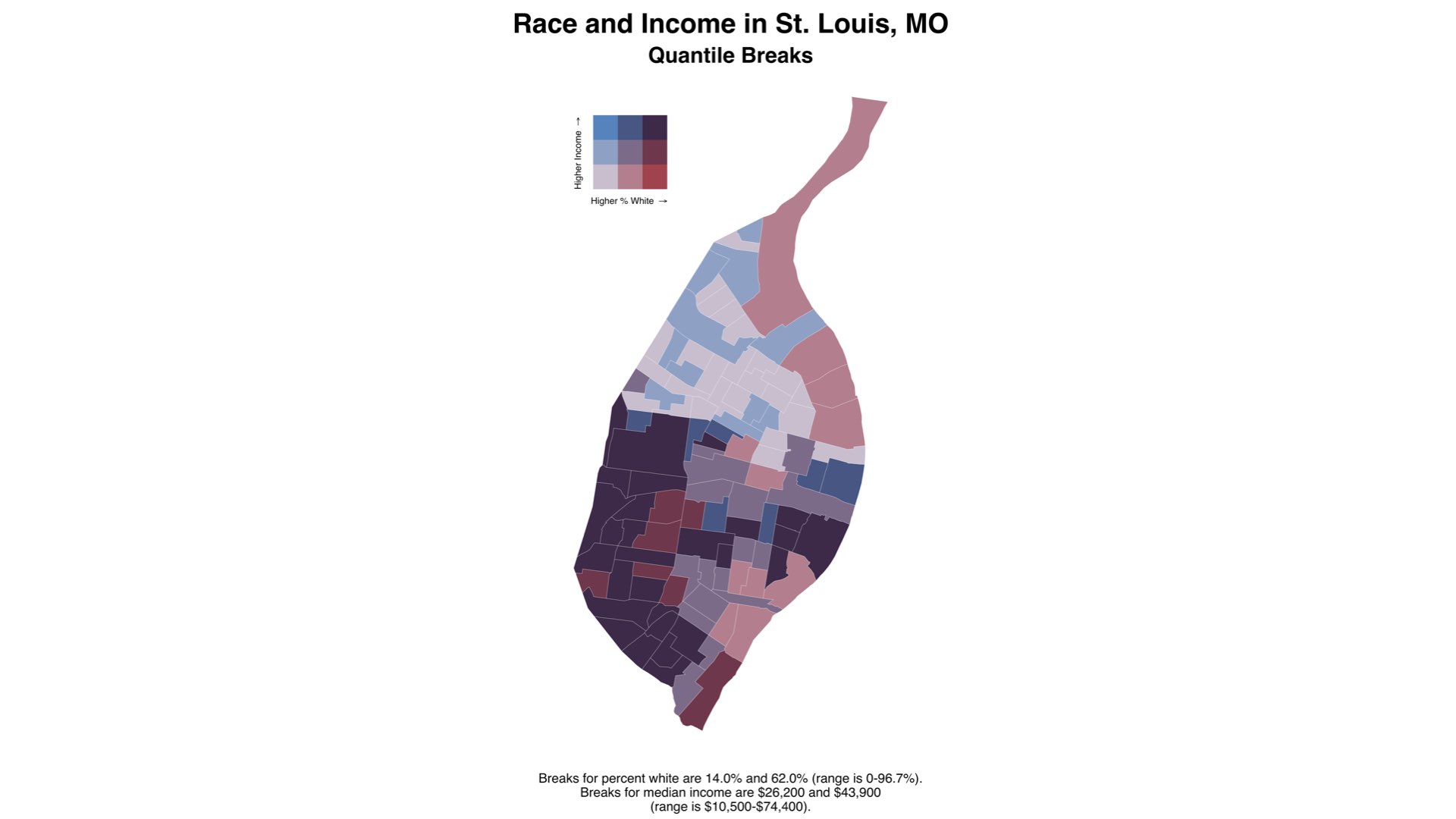
"jenks". The default "quantile" approach will
create relatively equal “buckets” of data for mapping, with a break
created at the median (50th percentile) for a two-by-two map or at the
33rd and 66th percentiles for a three-by-three map. For a four-by-four
map, breaks are created at the 25th, 50th (median), and 75th
percentiles.

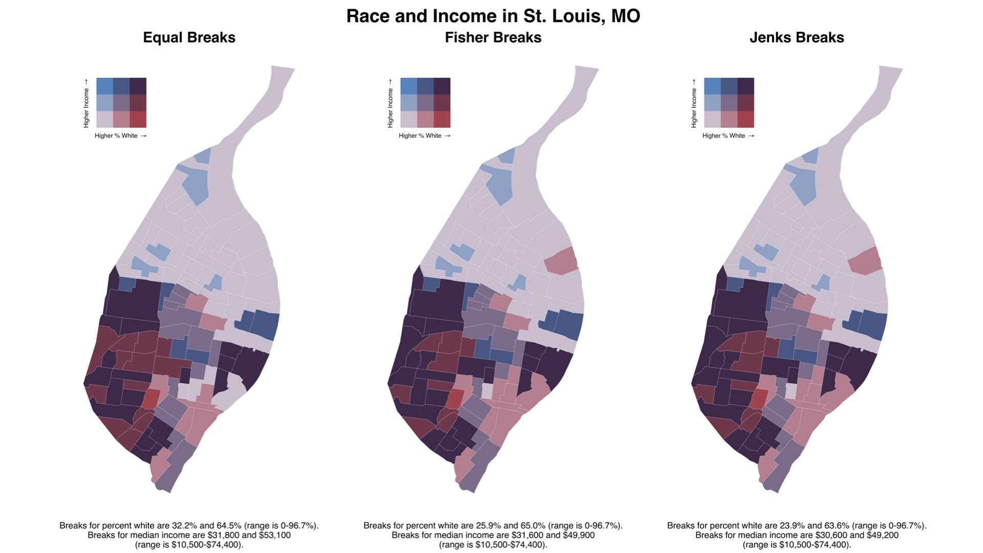
With the sample data, this creates a very broad range for the percent white measure in particular. Using one of the other approaches to calculating breaks yields a narrower range for the breaks and produces a map that does not overstate the percent of white residents living on the north side of St. Louis:

Users should therefore choose methods for calculating breaks carefully as well as the number of dimensions mapped.
As of v1.0, biscale now supports larger
dimension maps as well as custom breaks for maps. For an overview of
these options, see the “Options for Breaks and Legends”
vignette.
Bivariate Mapping with Biscale
Creating Maps
Once breaks are created, we can use bi_scale_fill() as
part of our ggplot() call:
# create map
map <- ggplot() +
  geom_sf(data = data, mapping = aes(fill = bi_class), color = "white", size = 0.1, show.legend = FALSE) +
  bi_scale_fill(pal = "GrPink", dim = 3) +
  labs(
    title = "Race and Income in St. Louis, MO",
    subtitle = "Gray Pink (GrPink) Palette"
  ) +
  bi_theme()
This requires that the variable bi_class, created with
bi_class(), is used as the fill variable in the aesthetic
mapping. We also want to remove the legend from the plot since it will
not accurately communicate the complexity of the bivariate scale.
The dimensions of the scale must again be supplied for
bi_scale_fill() (they should match the dimensions given for
bi_class()!), and a palette must be given. For reference,
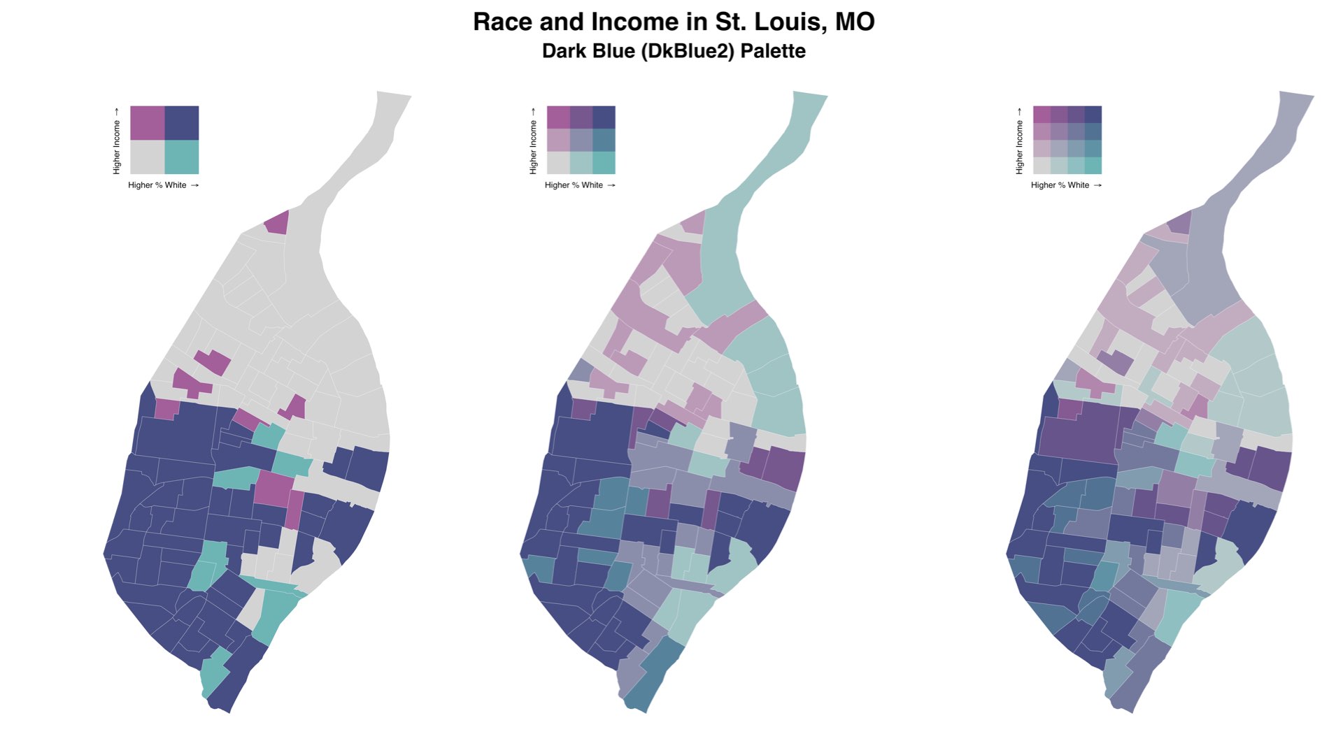
the top image above uses the "DkBlue" palette, the map
images in the breaks section above use the "DkViolet"
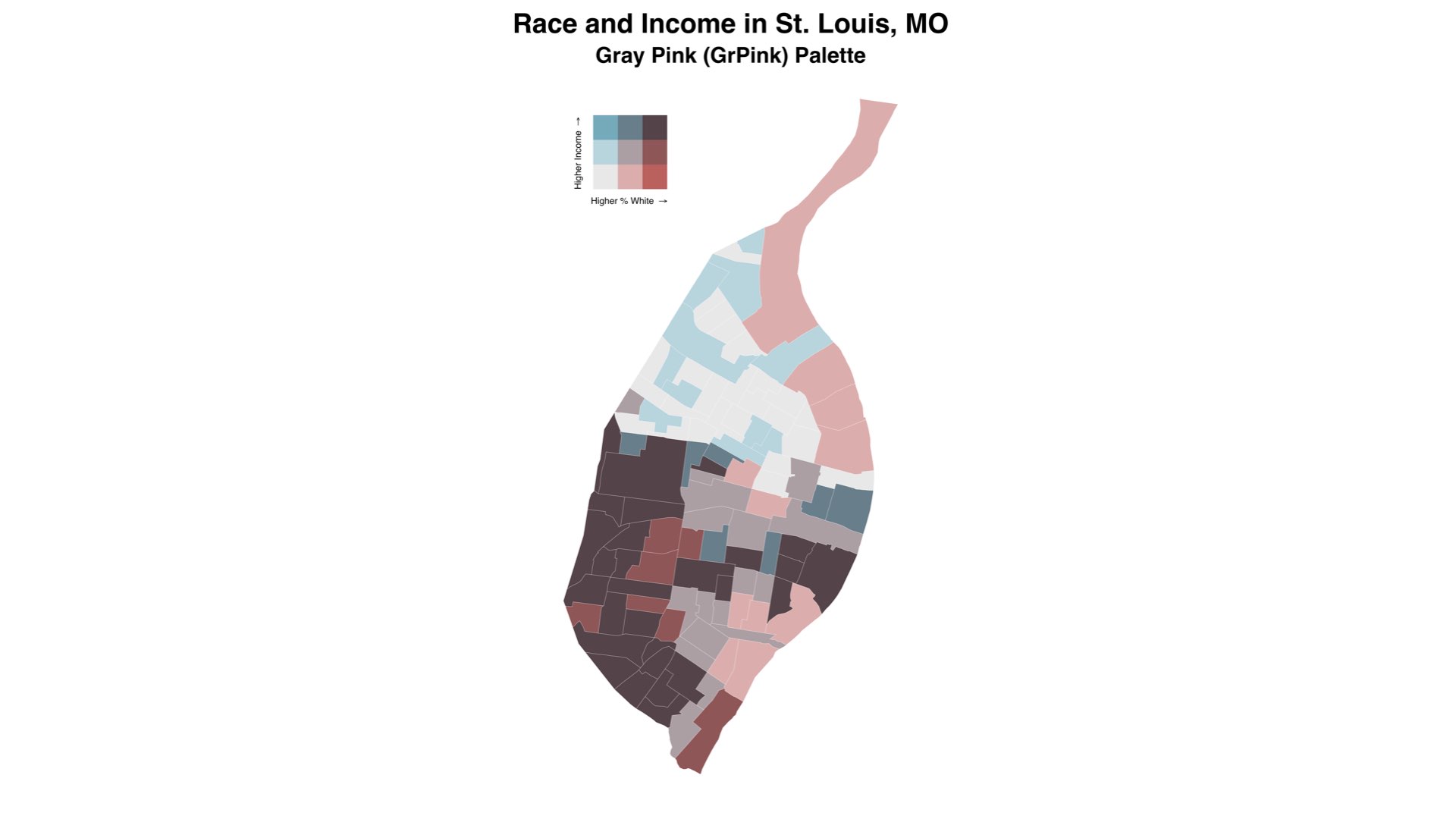
palette, and the map constructed in this section (and displayed below)
uses the "GrPink" palette. Note that, as of v1.0.0, the
number of options for palettes has been expanded and there is increased
support for custom palettes. See the “Bivariate Palettes” vignette or
?bi_pal for more details.
If you are mapping point data, there is an alternative function
bi_scale_color() that works the same way as
bi_scale_fill().
The example above also includes bi_theme(), which is
based on the theme designed by Timo
Grossenbacher and Angelo Zehr. This theme creates a simple, clean
canvas for bivariate mapping that removes any possible distracting
elements.
Creating Legends
We’ve set show.legend = FALSE so that we can add
(manually) our own bivariate legend. The legend itself can be created
with the bi_legend() function:
legend <- bi_legend(pal = "GrPink",
                    dim = 3,
                    xlab = "Higher % White ",
                    ylab = "Higher Income ",
                    size = 8)
The palette and dimensions should match what has been used for both
bi_class() (in terms of dimensions) and
bi_scale_fill() (in terms of both dimensions and palette).
The size argument controls the font size used on the
legend. Note that plotmath
is used to draw the arrows since Unicode arrows are font dependent. This
happens internally as part of bi_legend() - you don’t need
to include them in your xlab and ylab
arguments!
Creating a Final Output
With our legend drawn, we can then combine the legend and the map
with a package like cowplot. The values needed for this
stage will be subject to experimentation depending on the shape of the
map itself.
# combine map with legend
finalPlot <- ggdraw() +
  draw_plot(map, 0, 0, 1, 1) +
  draw_plot(legend, 0.2, .65, 0.2, 0.2)
This approach allows us to customize legend’s placement and size to
suit different map layouts. All of the maps shown as part of this
vignette were produced using this approach. There are other approaches
you could take as well that do not use cowplot. Note that,
because cowplot requires R v3.5, it is not
included as a suggested package (to maintain backward
compatibility). Beginning with v1.0.0, there are additional options
for constructing legends with biscale. Please see the
“Options for Breaks and Legends” vignette for more details!
The completed map, created with the sample code in this vignette, looks like this:

Getting Help
- If you are new to
Ritself, welcome! Hadley Wickham’s R for Data Science is an excellent way to get started with data manipulation in the tidyverse, whichbiscaleis designed to integrate seamlessly with. - If you are new to spatial analysis in
R, we strongly encourage you check out the excellent new Geocomputation in R by Robin Lovelace, Jakub Nowosad, and Jannes Muenchow. - If you have questions about using
biscale, you are encouraged to use the RStudio Community forums. Please create areprexbefore posting. Feel free to tag Chris (@chris.prener) in any posts aboutbiscale. - If you think you’ve found a bug, please create a
reprexand then open an issue on GitHub.
Suggesting Features or Changes
If you have features or suggestions you want to see implemented,
please open an issue on GitHub
(and ideally created a reprex to go with
it!). Please note that this project is released with a Contributor
Code of Conduct. By participating in this project you agree to abide
by its terms.